Philosophically, it’s our identity, our mark….Not-so-philosophically, it’s the huge installation you see when you enter the institute building, primarily fulfilling its apparent purpose of coming in everyone’s way, or as an efficient lumbar support device! For the people who still don’t have any clue as to where this conversation is headed, it’s the pretty yellow thing you rest your bum on, coincidentally also present on the brochures and other documents…
For the beginners, the installation is a 3D version of MITID’s logo. Not many people know about the logo. They just take it for granted.

I personally could not figure out what exactly this logo meant. At first, it seemed like the basic form of a television, or radio, representing the design link between communication (the purpose of the radio/TV), and the industry (the radio/TV itself). Later, after receiving a lot of explanation, and after craning my head in every possible angle to look for sense in the logo, did I realize that it was an abstract combination of the letters ‘i’ and ‘D’, merged to give us our graphical identity.
The logo was designed by a Pune based design firm, Lokus Design (also the firm behind the original architectural plan of this institute). It was the result of an extensive design process revolving around several attributes, which the institute would stand for; some being:
“Grand; Dignified; Simple and Pure; Honest; Integrated; Boundless; Changing/ Evolving; Innovative; Indian; Experiential; Respectful; Modern and Hi-tech; A school of thought promoting design as the human face of technology.”
The designers considered several other criteria as well to evolve the logo. First, it had to be adaptable -- as an identity for an institute with a massive number of people (a variety of mindsets) and different departments, it had to be flexible enough to manifest itself comfortably in a lot of contexts. Second, the logo had to retain its essence and aesthetics, whether in 2D or 3D, thus lending itself to applications like trophies, installations, signage, etc. Another criterion was its limitation to just one color. Last, but not the least, the logo had to be simple, yet the association of the logo with the institute had to be instantaneous to the viewer.
After taking into account all of the aforementioned criteria, the following concepts were generated. Some concepts were explored to illustrate the principle of ‘Sadhan’ and ‘Sadhana’ resulting into the boundless ‘Sadhya'.
Concept 1
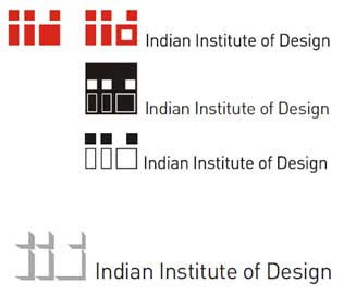
The first concept was kept simple and straightforward. It was made very geometric and would have been easily adaptable, but lacked an emotional appeal.

Concept 2
Taking the 1st concept forward, this concept tries to evoke a sense of magnanimity, (presumably by the use of red).

Concept 3
Using the Mobius strip to denote ‘Sadhan’ and ‘Sadhana’ forming a boundless whole i.e. ‘Sadhya’. The logo had a lot of scope for application on both 2D and 3D media, but it does not have the initials of the institute, by which people could easily correlate the name of the institute and the logo

Concept 4
An abstraction of the letters IID (sorry for the interruption…but if you haven’t noticed, the institute was initially called the Indian Institute of Design) . This concept is simple yet interesting. Sadly, in a single color, it would look too abstract or would lose its meaning.

Concept 5
Simple approach keeping in mind the significance of the three elements of the core philosophy i.e. ‘Sadhan, Sadhana and Sadhya’.
This approach lead to formulating a symbol that was geometric, direct and simple.

Concept 6
Playing with the letter forms, a very intriguing combination was achieved. It unfortunately did not reflect the attributes which it was supposed to.

Concept 7
Deriving a form that showcases the interdependence of ‘Sadhan’ and ‘Sadhana’ and one that also relates to the letters IID.

Concept 8
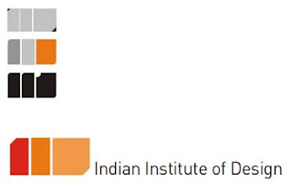
Simple and straightforward. Dignified, yet modest. Easy to remember, but difficult to distinguish.

Concept 9
This concept played with positive and negative space, giving a feeling of depth and perspective. Sadly, it was not unique enough.

Concept 10
‘Sadhan’ and ‘Sadhana’ giving rise to a boundless whole. A basic and simple form depicting this idea, and at the same time forming the letters IID. Simple. Unique. Bold. Unconventional. It also held great scope of exploration in 3D.


Concept 11
A simple abstraction of the letters IID, executed in a very playful way. However, it gave too much emphasis to the letter D, causing an imbalance.

Concept 12
A variation of the above concept.

Concept 13
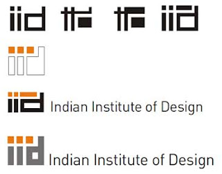
Further abstraction. Fewer elements make the form simpler. However, one would take a little while to identify the letters within the form. But overall interesting enough to keep one engaged.

Concept 14
Now we’re very close to what became our final logo. This concept is a softer version of the previous one. It was simple and minimal. This concept was initially the approved as our logo, until just before the institute commenced.

Concept 15
The final concept. A modification was made in the previous concept to give us this logo. The word Indian was dropped from the name of the institute, thus accounting for the change in the logo. The name of the institute was changed too, to MAEER’s MIT Institute of Design. The following, since then on, has been our identity.


To summarize, here’s a look at the entire morphosis of the initial concept into the finally approved/ applied logo.

As you might have guessed, designing this logo wasn’t an easy task. The painstaking amount of creative outflow is obvious from the process outlined above. The end product, however, looks so simple that sometimes one could be given to overlook the amount of in-depth ideation that has gone in. So much so that some of us might even go to the extent of thinking that it has hardly been designed. But I have learnt now, that that’s where the magic lies. It’s only design that can make an idea look so natural, so simple that it seems just “right”.The logo is inevitable, and it is thus by design.
---
Compiled by: Sarang Sheth
Sarang is a 2nd year student of Industrial Design at MITID. Apart from writing occasionally he has been pursuing Hindusani classical vocals since 1997. His other interests include reading and “downloading”. This article was originally brought out as a part of the students’ newsletter – Hive, in August 2010. Sarang has compiled the information given in this article from the official design document/ presentation prepared by Lokus Design, Pune.